


Patterns in the Sky
On the Taylor Swift of Astronomy

Author’s note: this is part 1 of a longer reflection on the amazing HR diagram and our life stories. More coming soon!
Astronomers, like most people, like learning stories. When we meet a star we want to know: where’d you come from? What makes you shine?
I’ve written many a proposal trying to justify what we’re doing with our telescopes; in the end, I find they come down to a quest for story, the witness of the universe. “When someone tells you their story, that’s a sacred thing,” one of my friends told me the other day. “Sometimes when I listen I have to take off my shoes – I’m on holy ground.”
But some stories are easier to learn than others. Stars, it turns out, can be harder to listen to than Ents speaking Entish. We’d like to watch all the details unfold like a movie – their tumultuous births, flaming lives, and violent deaths. Problem is, they live too dang long. How do you watch a movie that lasts 10 billion years? I don’t have that kinda time. Sheesh, I watched three hours of Dune and was like - who has time for this?
So we have a problem.
But we also have some data. We’ve snapped a lot of pictures of stars over the years. Each captures a moment, like random frames from millions of movies. Some pictures happen to be of young stars – swinging in some intergalactic playground – and others quite old – settled into their cosmic chairs. It’s like going in your grandma’s basement and finding boxes and boxes of loosely piled projector slides (do they even make those anymore?). Start picking through them and you see people frozen in time. Who’s that baby? And there, is that my great grandpa?
Now, these pictures might seem unusable. A disorganized pile of the universe’s history with no hope to unravel. Especially since each star’s story certainly will be a little different. How could we hope to order it all?
Well, hope, we cling to that. Here’s what we hope: that if we look at enough stars, enough frames from enough movies, patterns will emerge. On this big bet, we go all in. We bet the house that star’s lives will turn out to be, at some level, more or less the same.
Think of it like people. Sure our lives are different. I live in Chicago, have moved 10 times, grew up with goats, and dislike popcorn. You, on the other hand, probably don’t live on the Brown Line, prefer sheep, and actually enjoy getting those kernel shells stuck in your teeth.
But if you zoom out a little certain patterns emerge. All of us tumbled from a warm womb and needed our umbilical cords snipped. It’s safe to assume you probably disobeyed your parents a few times, learned about George Washington, and probably y=mx+b. Many of us move out of the house, fall in love, and buy a house (or cry because that was a dream that sailed about three economies ago. We all experience our bodies aging, pull muscles, and wonder if that mole is worrisome. Nursing homes are likely, a casket or urn certain. For all our hope of autonomy, individuality, and free will, I find I’m often surprised by the many ways we are the same.
But I stray. Point is, we make a bet on patterns, a gambit for understanding in the midst of the night. Still, a million snapshots, a grandma’s basement of old projector slides, are useless without a way to organize them. We need some tool, lest we become overwhelmed by the chaos.
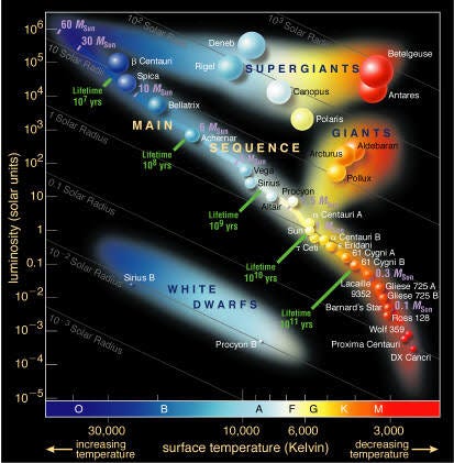
Luckily, that tool exists. Friends, family, readers of all persuasions, I present to you the Hertzsprung Russell diagram (or HR diagram for short). The most famous graph in all of astronomy. Yes, it’s a graph, gasp, with a x-axis, y-axis, and lots of colorful dots that says “science!” But don’t let your eyes glaze over. You don’t want to miss this. Yes siree Bob, this the the Oprah, this is the Taylor Swift, this is the Tom Cruise of astronomy. And almost as hot.

To appreciate its fine features, perhaps I should tell you what you’re looking at. Each little dot represents one star at one moment in time. And the dot’s position is determined by how bright and how hot it is. The hotter the star, the further to the left1 it appears, and the brighter the star, the higher up.2
And when we look at these collected dots, oh what patterns we see! There’s a big strip down the middle of the plot, called the “main sequence,” indicating that for a lot of stars, the hotter they are, the brighter they are, which makes some sense, actually. But then there are these other groups of stars: a sort of wishbone like extension that goes from the middle of the plot up toward the right (we call this the “Red Giant Branch”) and an elongated cloud near the bottom which contains what astronomers call “white dwarf” stars.
Two things I immediately note in all this glitter:
1) Stars are not all the same. What variety - blue, yellow, hot, cool, very faint and very very bright (so different we had to do something funny to the spacing of the tick marks: rather than having the numbers go up normally (10, 20, 30, etc.), we instead make every tick 10 times brighter than the one below it (10, 100, 1000, etc.). This is called a logarithmic axis, and is helpful for squishing very different values onto the same plot).
2) And yet, stars also, apparently, have many things in common. They clump up in little areas of this plot, forming patterns just asking for us to try to understand.
With a little bit of physics we can use these patterns to piece together a story. I know you’re skeptical, but this glamorous little collection of dots is a key to unlocking those billion year stories of the lives of stars.
[TO BE CONTINUED]
For those familiar with graphs this may seem backwards: normal plotting convention suggests higher temperatures should be toward the right, yes? Well, yes, but you are up against the force of history here. This was the way it was originally done for obscure reasons related to the measurements from which the temperatures were calculated, and the convention stuck. So sorry!
These two things: actual brightness and surface temperature come directly from the two most fundamental things we can determine about a star from its picture: how bright it looks, and what color it is. The color, it turns out, tracks very closely with temperature - red hot is actually a cool star, white hot, much hotter, and blue hot the hottest of them all. So from the color astronomers calculate the stellar temperature. The other thing we measure is the brightness of the star. Now technically, this is a little complicated - it’s pretty easy to say this star looks bright or faint, but to figure out how bright they actually are we need to take into account how far away they are. Thankfully some powerful telescopes have measured distances using some geometry and how the stars move around, so we can do this: for star at different distances we modify the brightness to say what they would look like if they were all at the same distance.