


It's a love story? (and newsletter update!)
Reflections on the Taylor Swift of Astronomy

Author’s note #1 - UPDATES TO GALAXY GLASSES: This is my 104th post on Substack (yes, I know - I missed #100)! As my readership has slowly grown, I’m trying to figure out ways to improve the newsletter. One change is that my longer reflections will go out every other Friday morning (as opposed to Friday night, or, gasp, Saturday morning). I’ve also updated the email header, and the about page on the website. Baby steps, yes, but something. Thanks so much for coming along for the ride!
Author’s note #2: this post is part 2 of a reflection on the HR diagram and the choices of our lives. Part 1 can be found here — if you missed it, I recommend reading part 1 first! I’ve copied the (slightly modified) final paragraph of that post as the opening here.

With a little bit of physics we can use the patterns in an HR Diagram to piece together a stellar story. I know you’re skeptical, but this glamorous little collection of dots is a key to unlocking those billion year stories of the lives of stars.
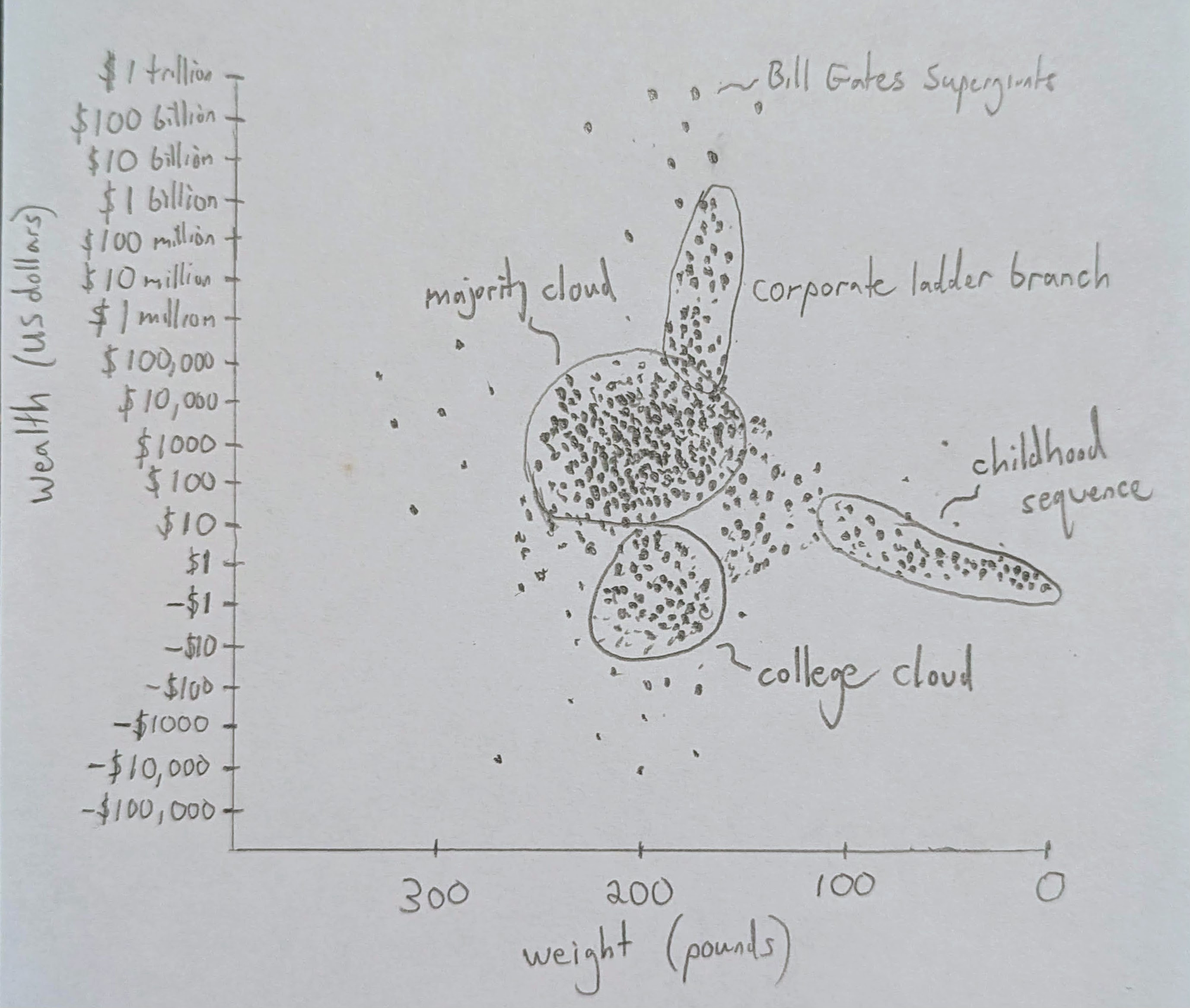
To make any sense of it, let’s first consider an analogous plot. If instead I was studying human lives I might walk around and collect data: instead of brightness, maybe I calculate people’s net wealth, and instead of temperature, maybe I just get their weight. Now I graph the data: each person a dot, heavy folks toward the left, tiny babies on the right, rich folks on top, those in the negatives1 on the bottom. (We could flip it, but let’s be real, this is the world we live in.)2
I imagine we’d see some patterns emerge. Over in the bottom right corner we’d see a “childhood sequence” from 6lb 9oz newborns with zero money to a 50 pound 2nd grader with a couple of dollars in their piggy bank (thanks tooth fairy!) to 90lb middle schoolers with an allowance. I imagine there’d be a “college cloud” of cash-strapped, debt accruing 19 year olds near the bottom with the extra freshman 15 added to their weight, and a few “supergiant Bill Gates” near the top. Perhaps we’d see a “corporate ladder branch,” splitting toward the top, and a “majority cloud” sinking toward the bottom, its mass of humanity adding weight while just trying to keep those bills at bay.
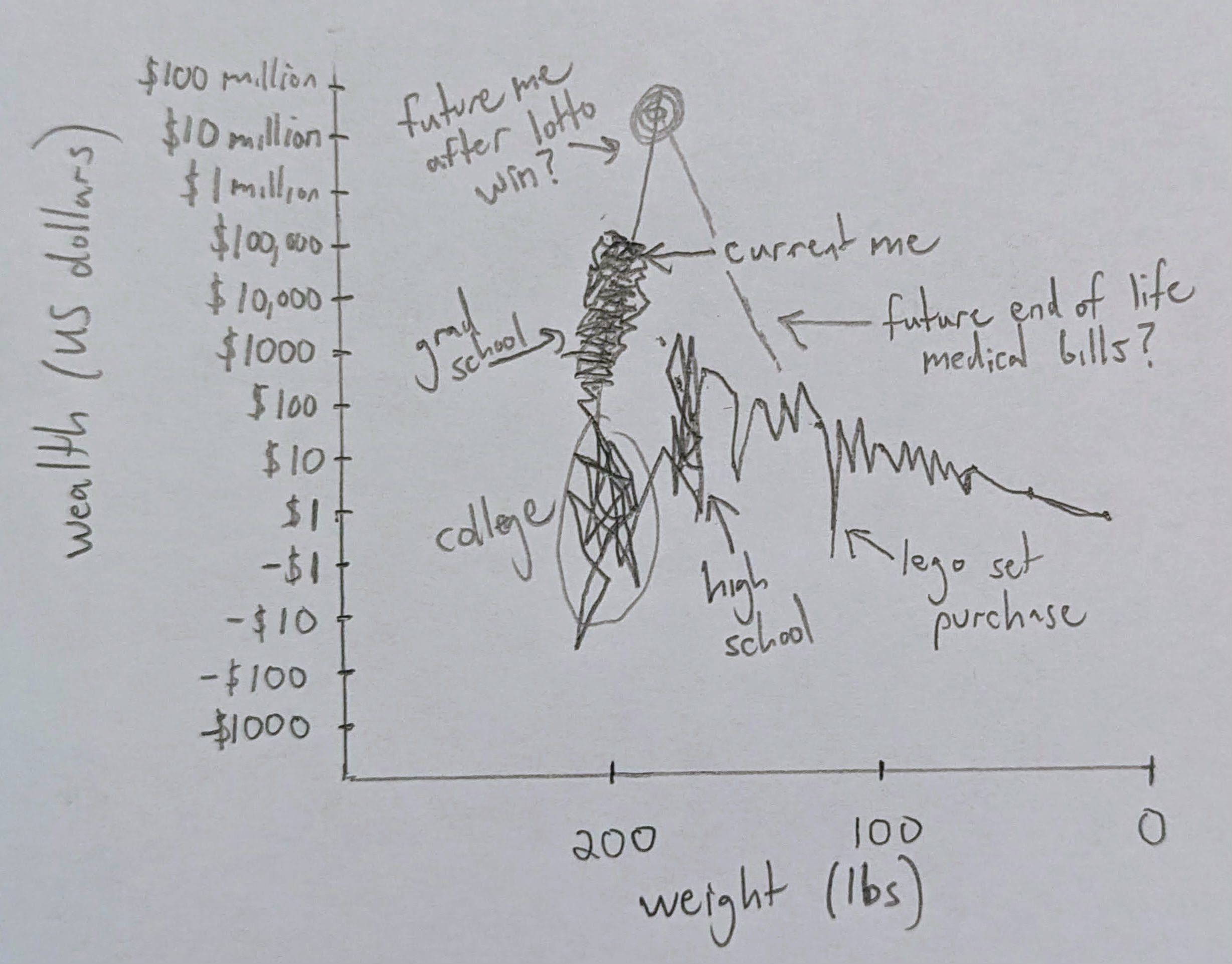
But now let’s try to connect the dots. Take my dot, not particularly interesting, sitting at my desk, some middling millennial with some savings, no equity, and 183.5 pounds after that burrito I just ate. That’s all you get of me. Except, now find another dot. Perhaps that high schooler fluctuating between 165 and 190 depending on whether it’s football season, and between $0 and $500 in the bank depending on whether he has a girlfriend. Or the college student dealing with overdraft fees and dorm food and a difficult breakup. Or the grad student taking a big net worth hit to buy a wedding ring, slightly lighter now that he’s working out with Jeremy. And ah, there’s the small college professor, a Doctor now, paid approximately the same as a garbage collector, blood pressure through the roof at the end of an 80 hour work week.
A movie starts taking shape.
And not just my past: I look around and wonder: is that the dip in the graph when I’ll finally afford a house after I go viral and make my first million? Or, more sobering, is that the precipitous drop in savings with those parasitic hospital bills near the end?
Now, clearly we need to add some information to connect the dots. We need a little understanding of the pushes and pulls that move me. We’d need to gauge the pressure to look good, weigh the temptation of wealth, or measure the decibels of those little (and by that I mean deafening) whispers of what I think others think of me.
But that’s what physics is: a measurement of pushes and pulls - the stuff that moves stuff in the universe. In the early 1920s, shortly after Ejnar Hertzsprung and Henry Norris Russell independently created their fancy graph, Arthur Eddington famously published several pieces working out the basics of stellar evolution, using his knowledge of the forces of physics, and the patterns he saw on the plot. His work was impressive in its scope, suggesting energy from nuclear fusion before it was discovered, and connecting the lives of stars and their positions on the diagram to well understood equations of physics.
Since then astronomers have refined Eddington’s techniques and improved on his data. Combined with an ever advancing understanding of physics (including nuclear physics - the physics of the hearts of stars), we have since been able to work out the contours of a star’s story.
Here’s a short version: stars form from the twirling collapse of large clouds of cold particles floating in space. These clouds heat up as they shrink and begin to glow, entering life on the HR diagram from the right. Stars spend most of their life stable on the main sequence, until a lack of fuel deep in their guts forces them to consume their regurgitated waste, a process that balloons their outsides, making them redder and brighter (the red giant branch). Most stars eventually completely lose grip of their outer layers, leaving behind a tiny white ball of their twice burned waste: a white dwarf star which will slowly cool till it’s no longer visible. Bigger stars might be able to squeeze a bit more out of their waste, holding their outsides a little longer. But at a cost. Eventually even that runs out in a catastrophic collapse, detonating the star in a supernova and leaving behind a black hole.
Quite a story, and kinda relatable. Even stars don’t get to take their riches with them.
Now, Eddington’s insights were brilliant, our subsequent advances impressive. Yet, as I recently read some of Eddington’s work, I was struck by how much he got wrong. He was operating with incomplete information, without our modern theories or improved data. Much of Eddington’s understanding was biased by the available data – where he chose (or was able) to look.3
Yet I identify, in some ways, with Eddington. To operate with incomplete information, to get some of it right and some of it wrong, to be informed and confused by the forces acting all around us – this is the human condition, is it not?
When I sat down to write about HR diagrams, I thought I might write about how the shared patterns of our lives might evoke empathy; I thought I might write about how our similarities bring us together, and how our collective experience might give us reason to cut each other a little slack.
Perhaps that’s true, in its way. But in the end, I’m not sure any data or graph or fancy logarithm ever did much to move us to compassion. After all, it’s just dots - assign what story you want. I begin to wonder if it’s less what the graph shows, and more what the graph hides that really tells the story.
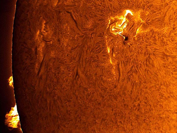
I remember once getting to view the sun through a large refracting telescope. I was at Fuertes Observatory preparing for some lab, and an undergraduate employee, several years my junior, called me over. “I got the solar filter working,” he said. I looked, and it was like I’d never seen before. Gone was the small yellow dot I remembered seeing through those eclipse glasses. Gone was any sense of calm, or peace. No, viewed through a H-alpha solar filter with a sufficiently large aperture, the true surface of the sun shows its face - a violent, boiling place, with wild bursting flares looping hundreds of miles above its surface. The telescope revealed an enormously complex creation: surface like a cracking stain glass mosaic covering an even more complex, churning interior.
All this hidden in one simple dot on our graph. We know intuitively our lives can’t be captured in a 2D plot. Yes, I think. No graph can fully penetrate the nuclear furnace of my heart. Yes, I declare: it grasps not the cracked and bubbling interior of my life. I am no dot, I shout at top lung.
And yet, the enormity of the universe echoes back to me, my cry lost in the vast emptiness surrounding our pale blue dot.
I pale at that echo, and so return to the data, my lungs slowly burning through oxygen as a star burns through hydrogen. Someday we’ll both run out. I guess what I see in the patterns of the stars is that I have some choice in the story I make of it. Is it all meaningless, or meaningful? Is it decay, or beauty? Is it all chaos, or is it love?
I inhale at this magnificent precipice, my breath held at this high choice; but soon, I must let go – each exhale a new chance to decide.
Technically log axes can’t handle negative numbers, kinda like technically bank accounts are supposed to have money in them. A negative balance would disappear off the plot, like our soul into the vacuum of the bank’s teller tubes. But for the sake of illustration, I’ve created a discontinuity that hopefully won’t kill too many mathematicians, and we’ll just pretend.
Also real: we’ll have to use a logarithmic money axis, because it turns out, the richest humans have even more money compared to the poorest than the brightest stars have luminosity compare to the faintest.
Indeed, it’s clear in reading old papers how much it matters what data you are looking at. The most easy to interpret HR diagrams end up only include stars from a single star cluster, where all the stars were born at the same time and place, and were all subject to similar forces. If you try to include a whole galaxy worth of stars, well, it gets messy to sort out all the different stories. Again, consider the analogy of a wealth-weight plot. The story I told was very USA - centric. Adding in data from other countries and cultures might look quite different (e.g., no tooth fairy - gasp!).
I hope your plot didn't kill the most important mathematician...the one you live with! :)
the little dip in your chart for a Lego purchase is real